Monday 23 April 2012

Year 2 Application of Design: Portfolio


Group Mood Board

The first page of my portfolio features the group mood board, which was required to be put into my portfolio.


Range Plan

The next page of my portfolio featured a double page showing the range plan for my chosen six outfits. The range plan features the front view in colour and the back view in white with black a outline and detail. The range also features the price of each garment, which i chose the prices for based on my shop report findings of Prada's price range of garments i reasearched.


Illustrations

The next part of my portfolio were these three pages of illustrations with featuring flat drawing back views, colour swatches in percentages, fabric swatches and the branding at the bottom of the page. The illustrations illustrate the three outfits i had chosen, with flat drawings that show the front/back that can't be seen that much on the illustrations.


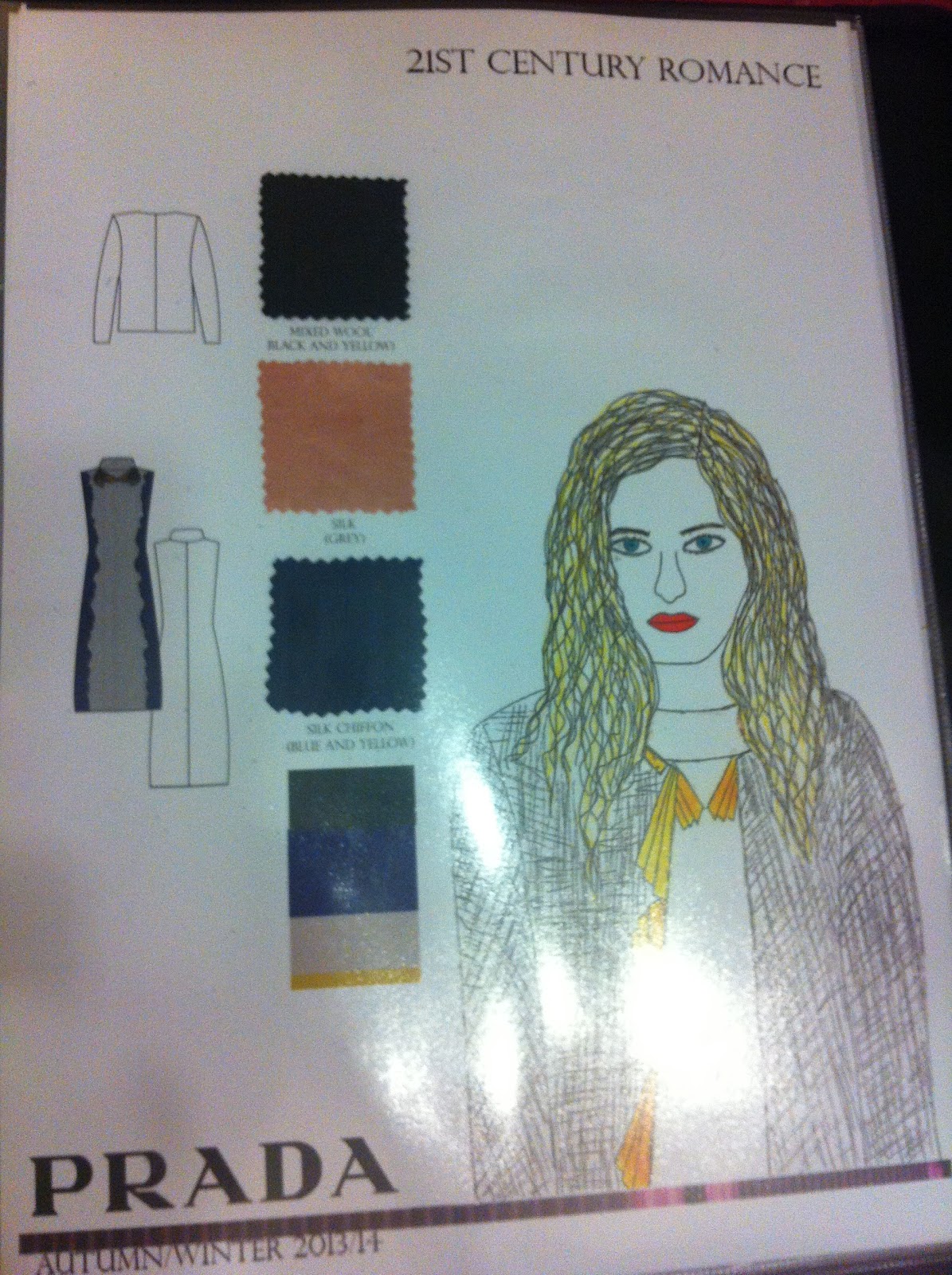
These illlustrations turned out ok in the end eventhough im not confident at drawing illustrations. To help me i used magazine poses, and then adpated my three chosen outfits onto the figure. I experimented with fine liner, inks and water colours to create different rendering techniques to make my illustrations visual exciting to help me develop me own personal style.
Design Development

For the portfolio i scanned in and rearranged my design development by improving it on Photoshop. I professionally improved it by typing up my annotation and fabric samples. I scanned in and arranged fabric samples and swatches. I also changed the colour of some of my drawings to improve the visual quality of it to a high standard. I found that by rearranging my design development on Photoshop enabled me to improve the visual quality to a high standard, successfully creating, interesting and improved pages suitable for my professional portfolio.


These five photos above are of the five strongest design development pages i had chosen to include in my portfolio. To professionally present it i scanned in and rearranged my design development from landscape to portrait so it would match with the rest of my portfolio pages that were portrait as well.
I am pleased with my small portfolio i brought together as it shows my strengths at being able to produce and create a range on illustrator. The portfolio also shows my strong variations in design development that I’ve adapted further through designing. By creating a professional portfolio has helped me understand how to set out a portfolio for my third year work successfully by presenting it creatively.

Year 2 Application of Design: Design Development


Design Direction Board

After completing all the initial research i picked out three inspirational samples from my range of research. I created a design direction board, to help me pin point key detail that can be further developed into my design development. The design direction board was a useful source to inspire and remind me, what key detail i was designing from to develop my designs through different garments.


Design Development

To begin my design development i used my design direction board as well as images of samples from my research sheets. The reason why i used images of samples was to show my understanding of forward thinking designs, i had tested out through sampling and then through to design development. As you can see from this design development page below, it shows the key imagery i used as my main source of inspiration. I've adapted the key imagery into a wearable and non-wearable design on a range of different coats.  


For this design development page my designs were focused around padded, geometric shape detail on a range of jackets. The use of key inspirational imagery fitted in well with my sample featuring geometric shoulder detail. I thought about creating overlapped, oversized, layered, entwined and padded detail. This developed the jacket designs a lot as i had a wider range of jacket designs to choose from, which complimented each other. The use of colour and fabric swatches have been used to identify the types of fabrics that would be used and it what colour.


For these two designs development pages below I’ve focused on designing a range of tops and shirts. I used key imagery and a picture of a sample from my research to inspire me to create a range of different designs. These images featured on this design page contain so much inspiration i combined the two together to create a range of designs. These range of tops feature overlapped detail, cut-out detail and geometric detail/print. I experimented creating similar designs to show slightly different and similar variations that have simple silhouettes with these hints of interesting detail.


For this design development page i chose this key imagery, which features geometric shaped, stitch detail on this bleached jacket. The geometric stitch detail linked in really well with my geometric pattern i made from a picture of printed painting. I used one part of the pattern i made from my research. A part of the pattern was repeated a number of times, to create a layered design for the sleeves and the front of a jacket. I enlarged the size of the pattern to show a variation in design to show a range of jackets that feature the same design interpreted in a number of ways.


By using key imagery as well as imagery of samples i made in my research, was a great way of combining and inpsiring design ideas i could experiment with further. My design development has progressed my strong ideas further by developing them in many ways as possible through a wide range of different garments. By experimenting with different designs on a range of garments, helped me to decided which designs suited certain garments. As i had to make sure my designs fitted well as part of a range.

Final Outfit Range

These images show my range of outfits i decided to choose as part of the range in the end. The colours vary from dark blue to a hint of golden yellow, which are featured within the key detail seen on the garments. These six outfits consists of statement coats, jackets and blazers. A range of trousers, skirts, dress, shirts and tops with hints of geometric detail.


Year 2 Application of Design:Research

Defining chosen designer brand
"Prada" 


For this project the brief was based on working as part of a design team for a chosen designer. As a group we decided to choose "Prada" as the designer we would design for. The season we had to design for was Autumn/Winter 2013/2014. As a group of five we decided who wanted to do women’s wear and who wanted to do menswear. I had chosen to design for the women’s wear. In order to understand and define "Prada" brand i researched into "Prada" Fall/Winter 12/13 collection. I created two boards pinpointing the key detail such as the pattern style, embellishment and key colours. By doing this helped me to understand what Prada is known for and how i would go about designing part of the women’s wear collection.


These are the two boards from my research that identity the key colours, details, patterns from Prada current collection Fall/Winter 12/13. The Fall/Winter 12/13 collection features bold patterns, vivid colour combinations, geometric prints and detailed embellishments. The silhouettes are simple and clean cut with hints of embellished detail that stand out on the dark toned colour palettes and on the vibrant coloured patterns.


Group Mood Board

After i had finished researching and defining Prada, as a design team we had to discuss what theme we were going to choose, in order to design a collection. I was really drawn to the 21st Century Romance trend on WGSN as i felt out of the three themes on WGSN this one was the most inspirational for me to interpret it into my own way. As a design team we decided on the theme 21st Century Romance. As a team we gathered a range of images and samples to go onto the group mood board. A group decision was made on how the board would be set out, a chosen colour palette created from the key imagery featuring 8 colours. This group mood board was a starting point to help us interpret the theme in our on way, by referring to the group mood board.


My Mood Board

By creating a group mood board and defining Prada brand, i created my own mood board of my interpretation of 21st Century Romance theme. My mood board features the colour percentage palette, key imagery and key fabrics. This mood board will help me with designing my women's wear collection for Prada by referring to my own mood board and the group mood board.


Research Sheets

I began my research by using my mood board as my key inspiration, i gathered a range of images i had taken at the V&A museum and The Louvre in Paris. I gathered a range of images such as intersting  celinging detail, ranaissance paintings, natural form and shape outline, outline mirror design detail, tapestry design.

For this research page i was particularly inspired by the natural form, inspired mirror detail. I chose the bottom mirror detail outline, that i drawn out and number of times. I thought about layering and folding the outline detail, by using paper to create interesting new shapes.


Moving on from using paper to create shape inspiration i had drawn the shape outline onto crepe fabric. I cut out two shape outline pieces of fabric, sewed down the middle using a wide straight stitch. I gathered the fabric to create ruffled detail and placed it on the mannequin to show what it would look like on the body. As you can see from my research below showing the samples i made, which i placed on the body.

For this research page i used a picture of a painting i took as i liked the shape outline and the colours used within the painting. I reduced and enlarged the size of the painting to create interesting, geometric pattern shapes. I copied the outline of the shapes i created onto calico as enlarged shapes, which i folded and pinned onto the body. By using calico to create these geometric samples gave me a wider range of shapes to choose from for inspiration for design development.

After focusing on shape inpiration, i then focused on key detail inspiration by looking at parts of interesting detail from a mirror design. I repeated the curved detail a number of times on a range of different materials to see, which material would work the best. I used gold pen, denim, paper, beads and leathearette to create these samples.

For this brief my initial goal was to make my research more interesting and creative with the way it has been set out. By drawing more and creating samples to show my forward thinking ideas created from my research. I feel that my research is visually exciting and inspiring as i think more about how i want it to be laid out.


Saturday 21 April 2012

Jewellery Elective: Final Piece

Final Body Adornment Piece

This is the final body adornment piece i made adapting one of my samples further into a final piece. For my final piece i added more acrylic pieces that i cut out and drilled a number of holes onto it. I made a range of different length chains to make sure this piece fitted right around the body, as well as being easily removed from around the body. I used brass to make big jump rings to put through the drilled holes. I also made a lot of small jump rings to make chains to join it all together to the big jump rings attached to the drilled holes. I'm happy with my final piece, as i thought it worked out really well with the materials i used. The colour of the brass complimented the blue colour of the acrylic and the size of the jumps rings were appropriate for the weight of the acrylic as it supported the weight.  
 
Full front view
Close-up bottom view
I cut out two pieces out the same twice as i wanted to have a mirror image as a centre of attention to balance out the design of the body piece.
Close-up front view
You can see the large jump rings which are attached to the drilled holes and then attached to the small jump ring chains.

 
Side View
Back View
The piece of acrylic has four holes drilled onto it, with chains draped down attached to the front of the body. This is to ensure it fits accuratly around the body.


Jewellery Elective

Experimentation with plastic acrylic


The brief for jewellery elective was based on body adornment. I thought about researching into recycled jewellery as i thought it would be interesting to recycle and recreating something exciting as a body adornment piece.
Below is a picture of leftover acrylic cutouts, which i found in a box in the workshop. There was a couple of sheets of this cut out acrylic, which was useful as i could experiment creating a range of samples.


These pictures show one of my experimentations i did by cutting out a piece of acrylic and then lacing it in the heated oven for 5-10 mins. I then took it out of the oven and then bent it into shape by holding it for a couple of seconds, until the acrylic went hard and  held its shape i molded it into. By beding the acrylic enable me to think of ways i could transform this plastic either as a piece of a necklace or a hand piece of jewellery.


 Experimenting with cut out acrylic

For my next experimentation i decided to cut out pieces of acrylic from the cut out acrylic sheets and then drilled small holes a number of times on all the 6 pieces i cut out. I drilled a number of holes onto the acrylic as i wanted to attach the acrylic pieces together somehow using string or jump rings. 

These pictures show a necklace sample using some of the pieces of cut out and drilled acrylic. I used string which i tied up in knots on boths ends of the drilled holes to go around the neck. To hold the rest of the necklace together i made copper jump rings, which i then placed through the drilled holes and attached a number of jump rings together to create an enlarged hanging pendant for a neck piece sample.


Experimenting to create final piece


For this sample i was experimenting with the type of metal to use to make jump rings i decided to use brass jump rings as it went better with the blue acrylic. I cut up more acrylic pieces and then drilled a number of holes on each of the cut out pieces and then sanded down the sharp edges. I made a range of chains in order to join the acrylic pieces together by attaching them together through the drilled holes.


 For the back design i thought about having one large acrylic piece that had two drilled holes and the top and two drilled holes at the bottom. As the front chain is connected to the two back neck holes, the chain hanging at the back was going to be hanging down while connected to the bottom hole on the other side.


By creating some samples enable me to decide which method was the best to construct a necklace together and the best materials to use that would be stable enough to hold the necklace together without it falling apart.


Year 2 Design Realisation: Final Design & Technical Package

Technical Package

As part of this project another requirement was to produce a technical package, which you would send to a manufacture if you were to have your garments to be made abroad with all the instructions, specifications, patterns and lay plan.

Heres is the first page of my technical package that features the final design i decided to choose, which was a playsuit with a middle panel as you can see.

This page features the front and back size specifications from the neck width to the dart length. This is to enable that all size specifications are correct when this playsuit is being manufactured by other people abroad.
This page outlines all the detailed specifications that are featured on the front and back of the playsuit.


This page features a lay plan. The lay plan shows the patterns placed closely together on the fabric. This was done to ensure no fabric was wasted when it has to be cut out as well as showing how much fabric is needed to make this playsuit.

These are the recommended manufacturer instructions, outlining how to put this playsuit together once all the pieces have been cut out.
 This is the front of the pattern envelope that contains all the pattern pieces for this playsuit.

At the end of this project i had successful created a good technical package that featured detailed flats, patterns, lay plan and specifications. As this was the first time i have created a technical package, this has helped me to understand the work load i will take on board for third year. It has also made me aware of the skills i will need to take forward, in order to produce my range of technical packages for my third year collection. My research featured a wide range of sources that helped me to understand the market levels i had documented. My design development has improved a lot as i like working on the stand and then interpreting my samples into design ideas. I find working on the stand easier as it inspires me with so many ways of designing from one sample.

Friday 20 April 2012

Year 2 Design Realisation: Design Development

Vintage Jacket

As part of my design development i was told to find a vintage garment, i decided to choose this vintage jacket below. I liked the simple jacket silhouette and the key detail featured on this jacket. The interesting textured fabric used on this jacket makes the key detail such as the collar, pocket flaps and darts stand out. By looking at my chosen vintage garment i picked out key detail from my vintage garment that i was going to take forward into my design development ideas.

Front and Back
view

These are some pictures showing the key detail on the jacket close up.
 Front Bust Dart detail

 Two Front Pocket Flaps

 Back Shoulder Dart


Design Development

The season i was desigining for was High Summer 2013.

In order to develop my design ideas i decided to unpick the sleeves off the vintage jacket. Once i unpicked the sleeves i turned the jacket inside out and placed it on a mannequin. I preferred working on a mannequin as it helps me to innovatively create unique shapes that inspire and develop me design ideas. I thought about turning the jacket inside out and pleating the inside of the collar to create interesting design shapes. By pleating the inside of collar enabled to think of ways how this pleated shape could be interpreted into my design development. As you can see below i used this detail as inspiration to create a design for a collar on a sleeveless blazer and on a dress.


For this design development page i thought about leaving the jacket inside out and turned the collar inside out so you could see the white lining inside the collar. By doing this created an interesting sample using the inside of the collar as inspiration. I folded in the collar to create layered detail, i took this sample forward by adapting  the layered detail on one of these dress designs. I used the outside shape to create a halter neck strap as you can see below.

I carried on working on the stand by positioning the jacket inside out on the mannequin in a different way to create a one shoulder pleated sample as you can see from my design development page below. I pleated the whole inside of the collar to create new, exciting and interesting shapes. This further developed my designs by working on a stand, it helped me develop designs for a one shoulder dress and a pleated skirt design.


For this design development page i turned the jacket from inside out to its original state. I thought about turning the inside of the collar out and positioning the collar in a certain way by pinning it to form geometric shapes. I thought the geometric shapes created by pinning the inside of the collar out would be an unusual yet interesting design. Geometric design that could be further developed as a design as a collar on a jacket or neck detail on a dress. This inspired me to design these two garments below for my development.

I found working on stand easier as it helped me make use of my vintage garment by experimenting with shapes i could create on the stand by turning it inside out, pleating it in a certain. By taking pictures of the samples i created by changing the position and style of it helped me a lot to develop me design development. This gave me a wider range of ideas to choose from that i could take forward and further develop until i was happy with my final design.